METHODOLOGY/PROCESS
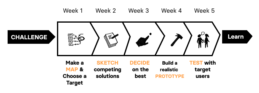
We used the 'Design Sprint Methodology' throughout our process
A Design Sprint is a unique process for validating ideas and solving big challenges through prototyping and testing ideas with customers.
Flikshop
Designing a digital learning management system for prisoners
This is an iConsultancy capstone project being completed by four University of Maryland students on behalf of Flikshop. This project gives us the opportunity to apply the skills learned through coursework to a real world problem. This project follows the design, prototyping and evaluation process from end-to-end.
Flikshop's mission is to support incarcerated residents and their families. Originally Flikshop provided support that enabled families to stay connected by mail. It has expanded to provide additional services, notably the Flikshop School of Business, an in-person education program.
Flikshop
Brandon Cooper
Markus Hines
Miya Oshiro
Kayla Winbush
Product Design
User Research
User Testing
Figma
Adobe XD
Miro
Photoshop
We will assist Flikshop with extending their offerings by designing an educational learning management system (LMS) that supports Flikshop's goal of preparing prisoners to qualify for in-demand jobs and to navigate the challenging social contexts of successful re-entry.
A Design Sprint is a unique process for validating ideas and solving big challenges through prototyping and testing ideas with customers.
Research to refine our understanding of the problem and opportunity and create and test one design concept to test with Flikshop scholars.
01
Having constant internet access can be seen as a security risks in prisons depending on the prison.
02
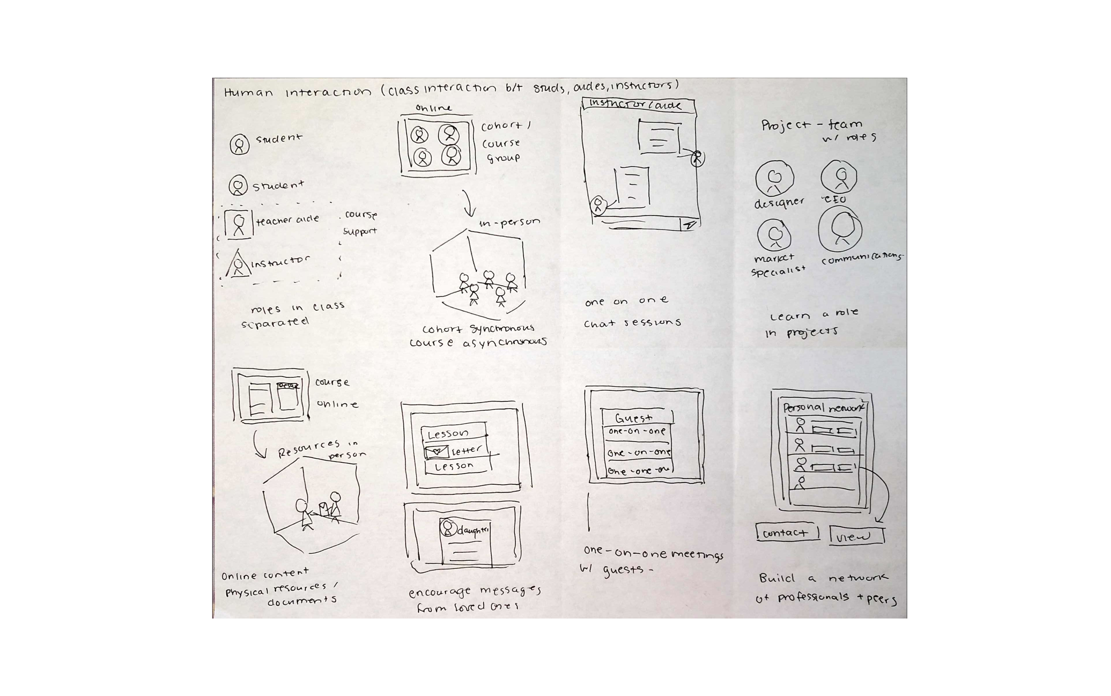
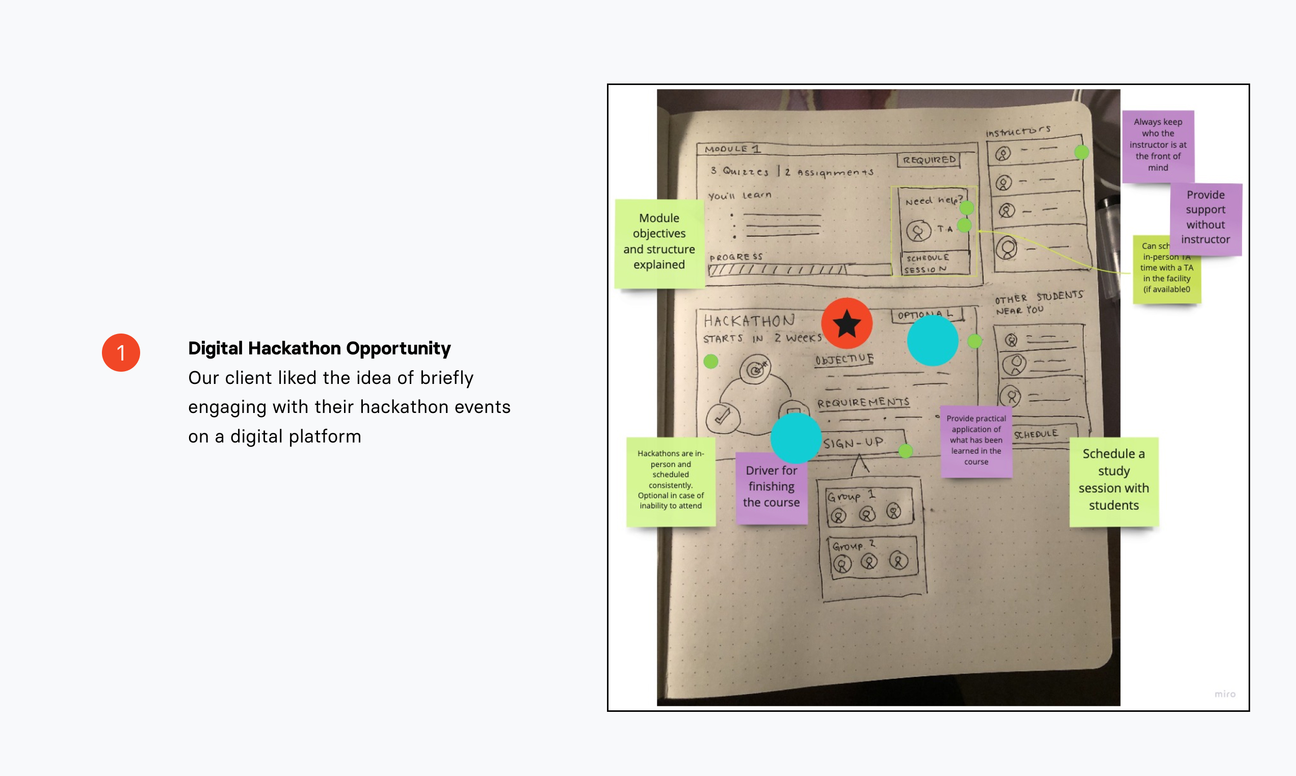
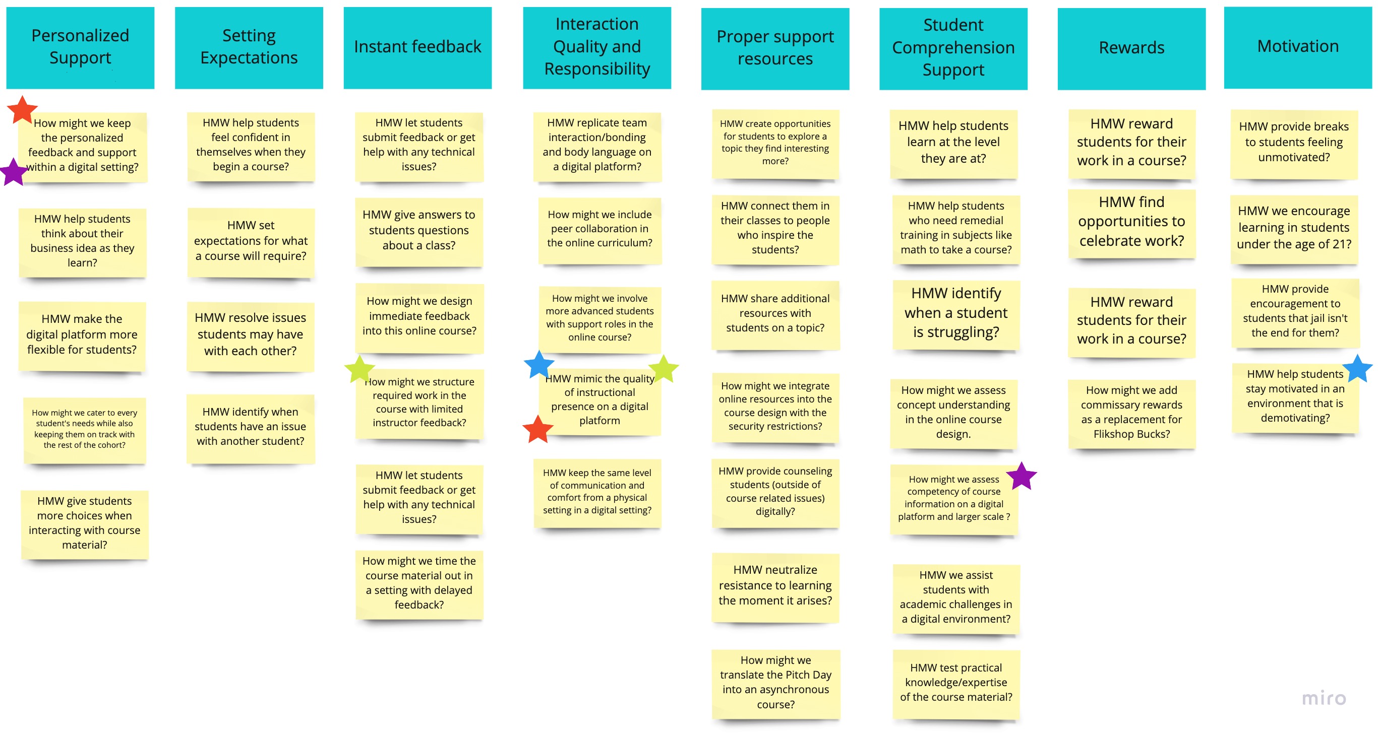
Fostering a peer-driven learning environment by including current and former prisoners in education and programming initiatives is motivating to students
03
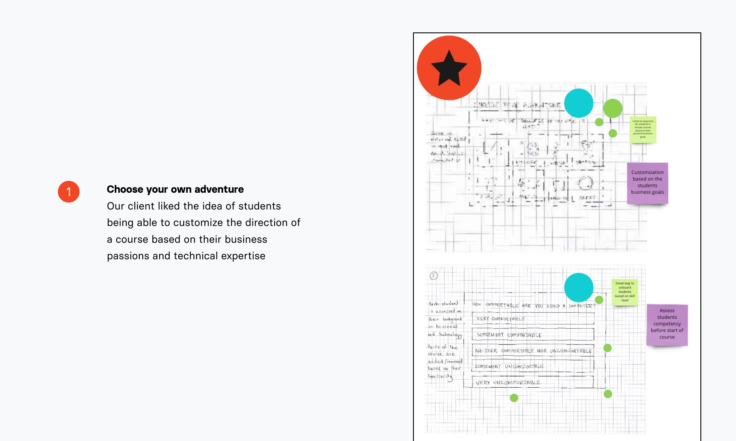
Education in prisons should be individualized to accomodate prisoner's diverse needs and learning styles
04
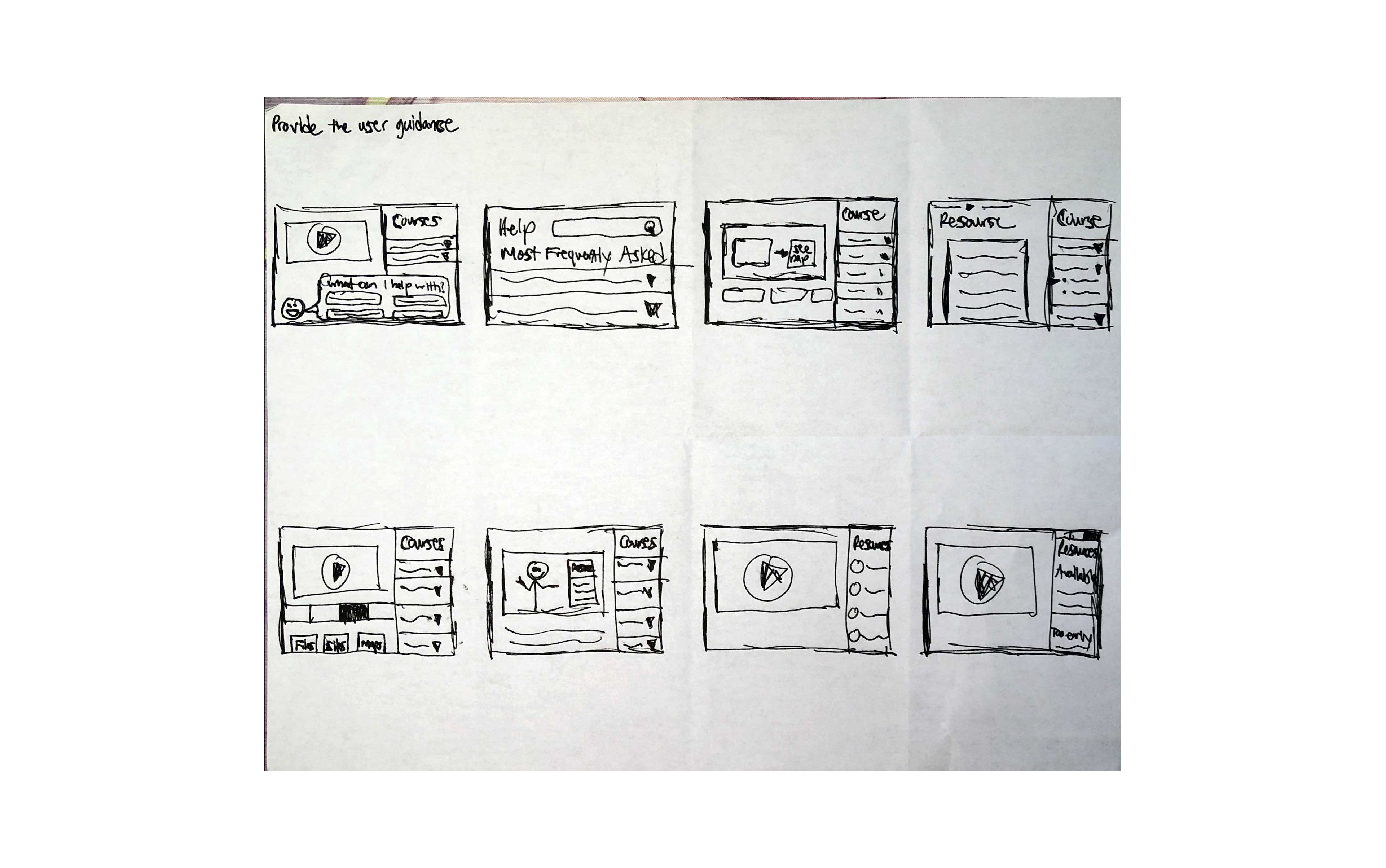
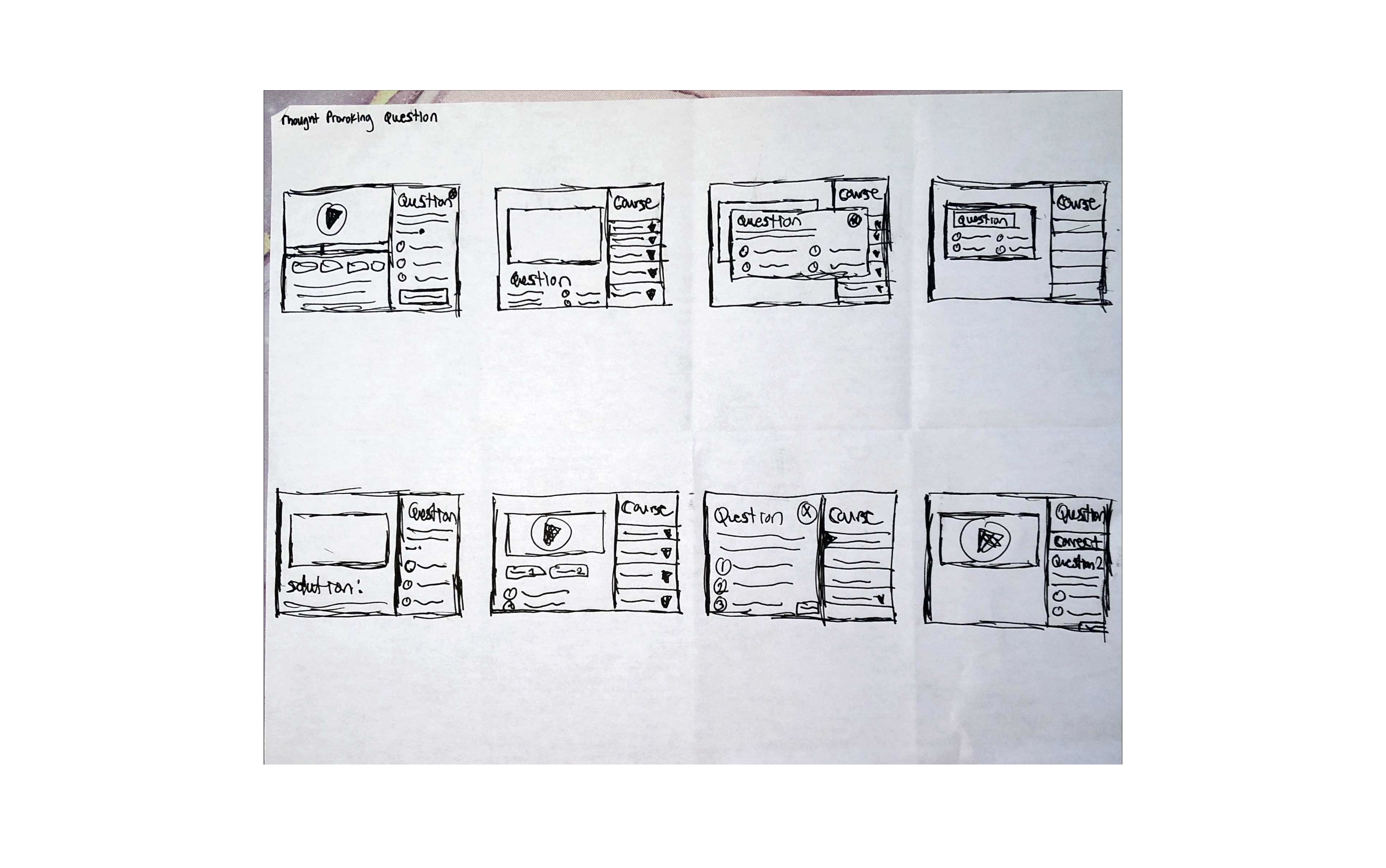
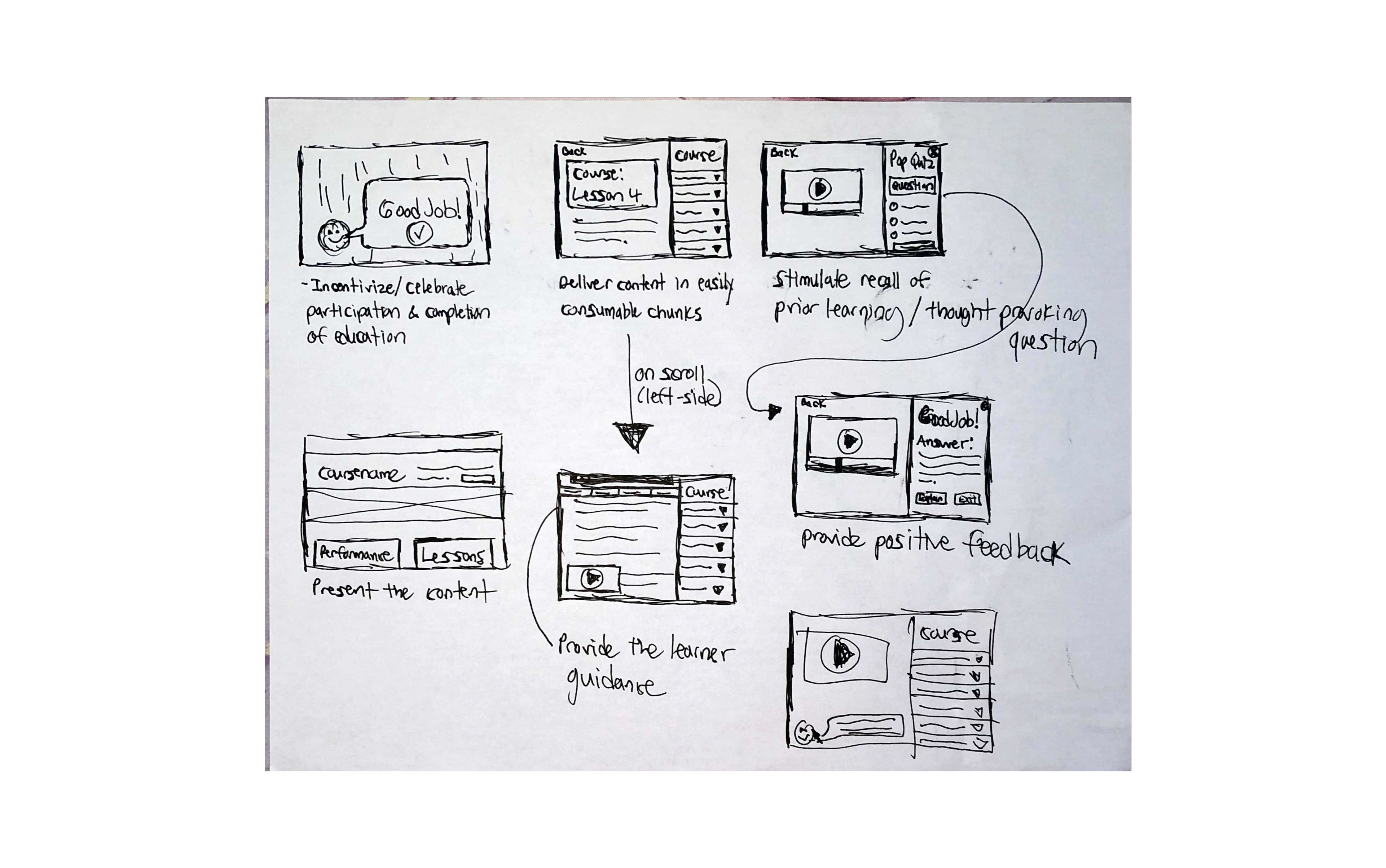
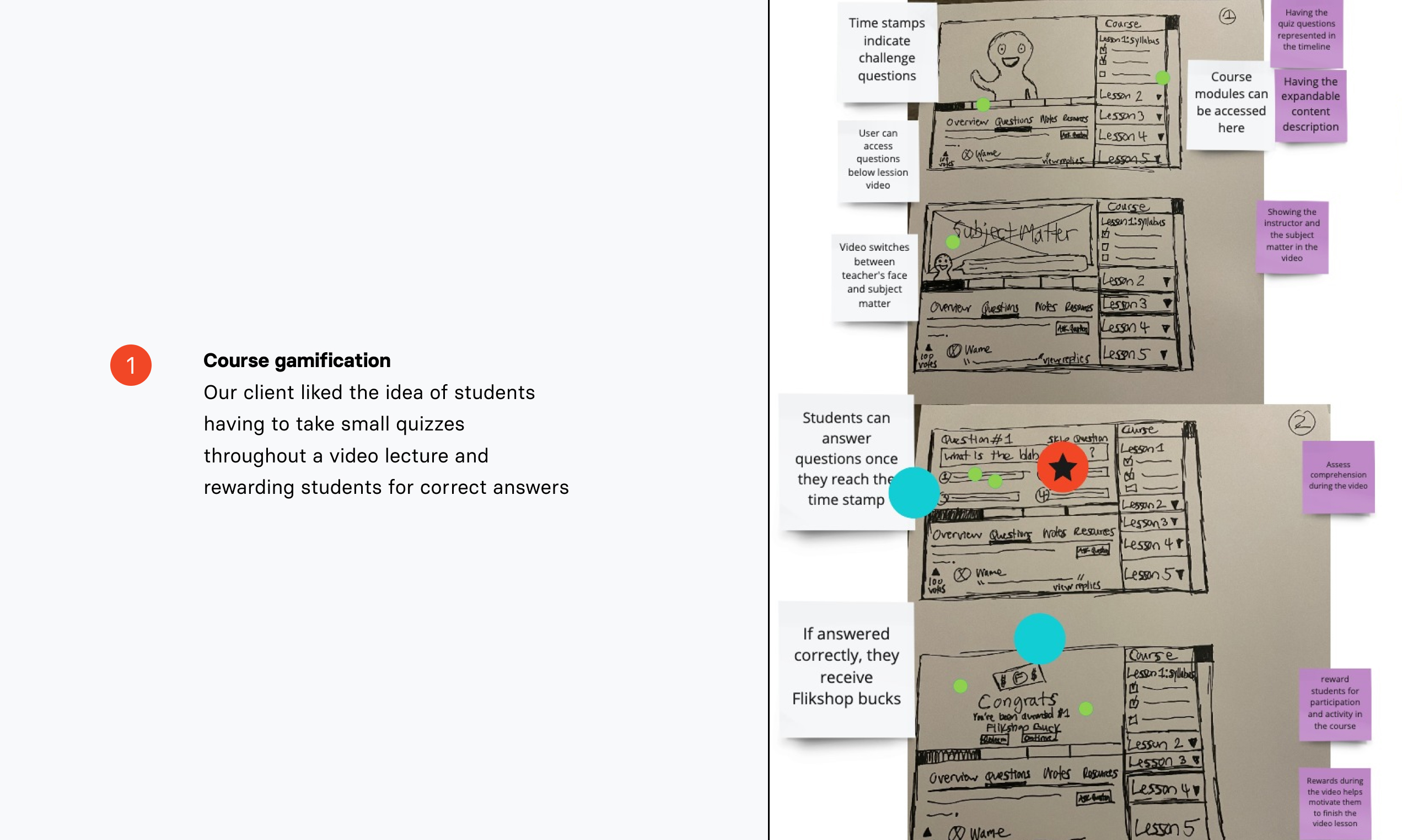
Referencing Gagne's Nine Events, learning material should be attention grabbing and stimulate recall of prior learning by engaging students with different activities
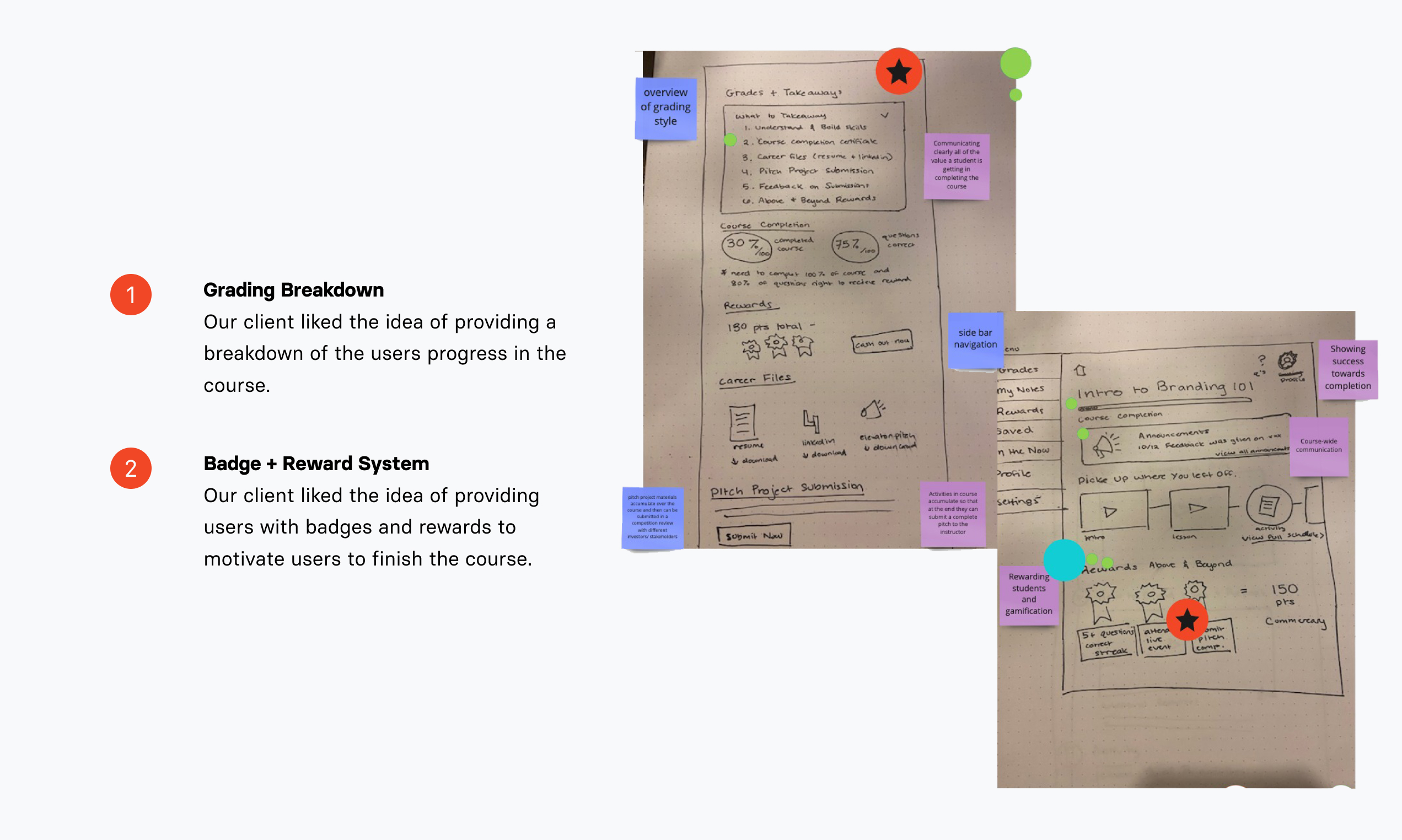
Each team member shared their Solution Sketch, and the client came to a consensus on a single idea through decision-making exercises.
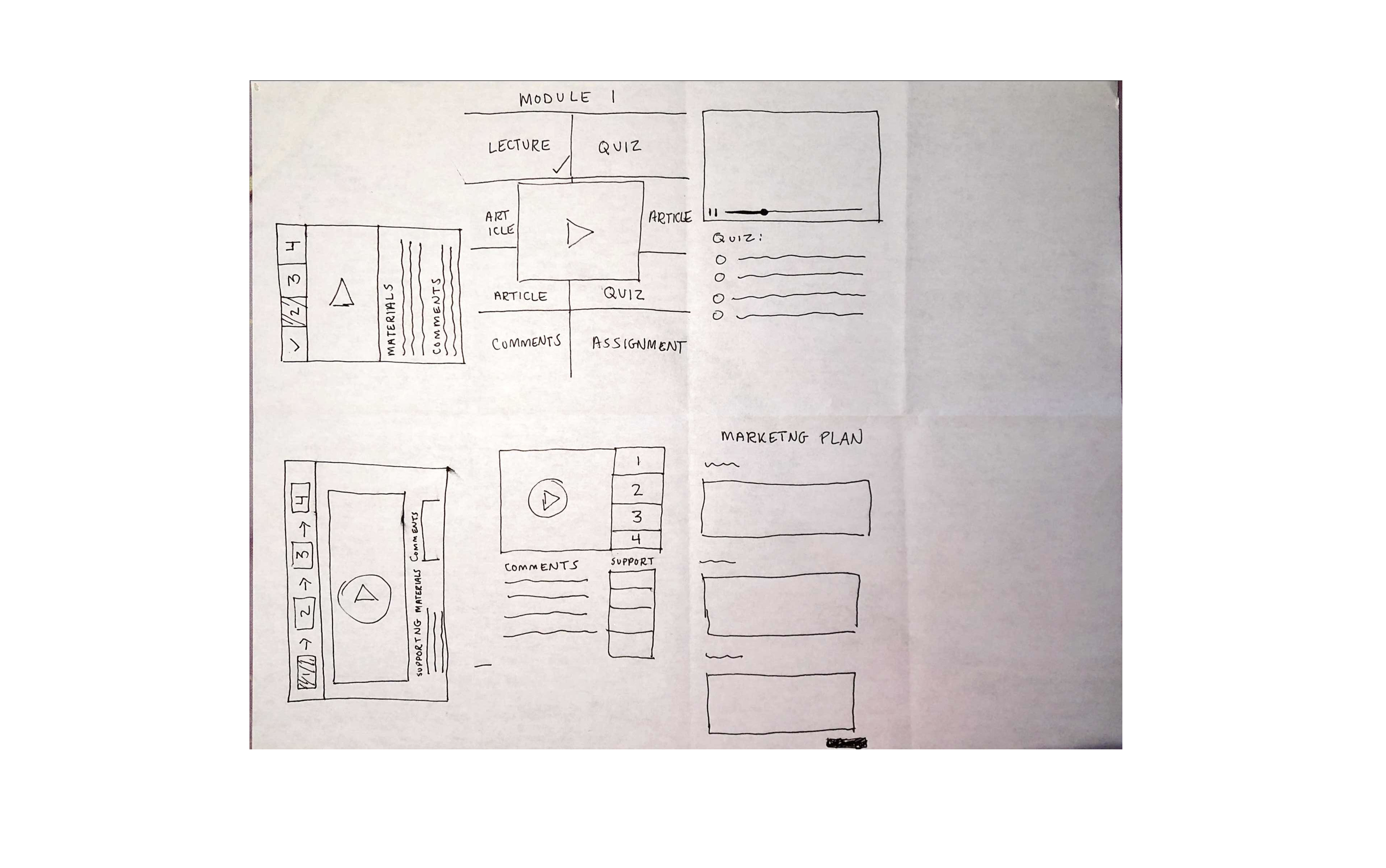
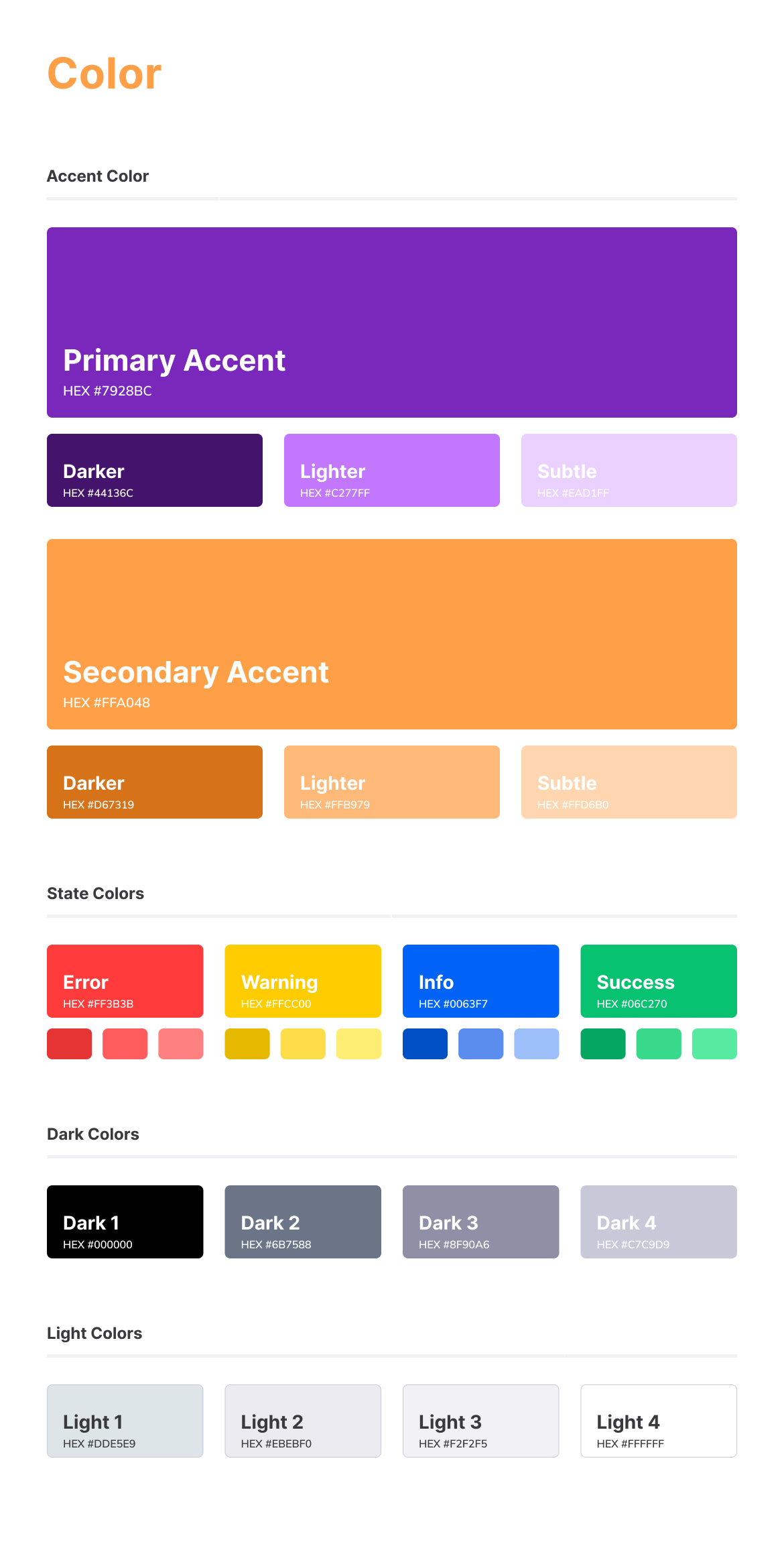
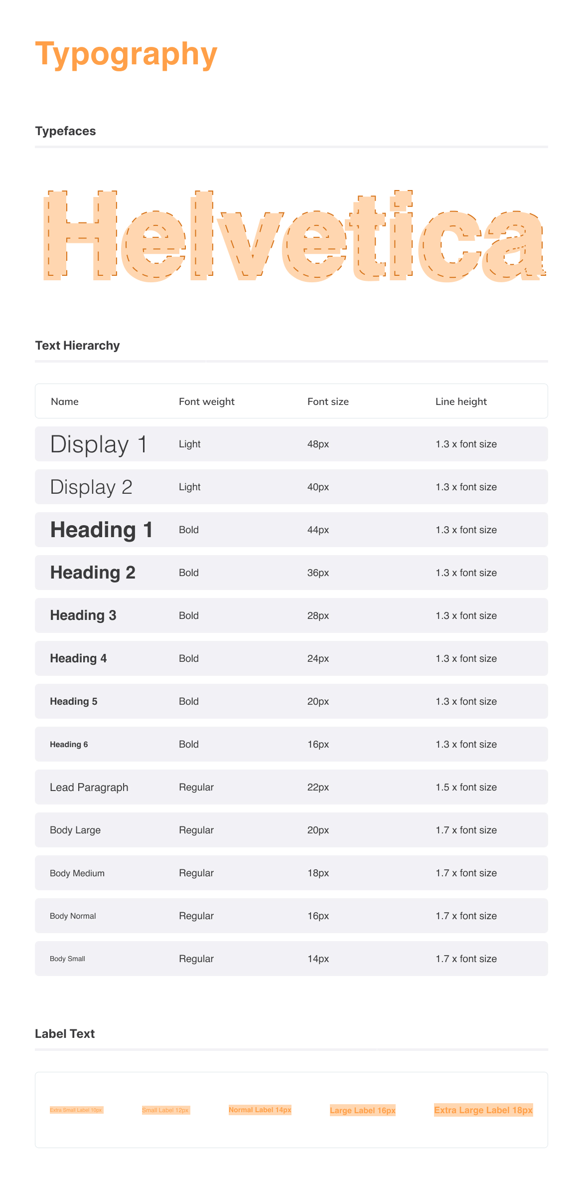
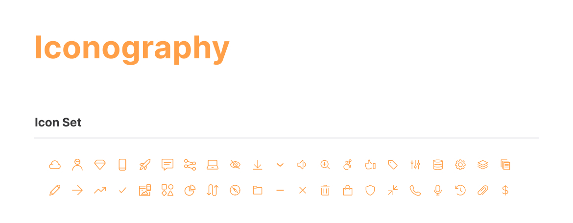
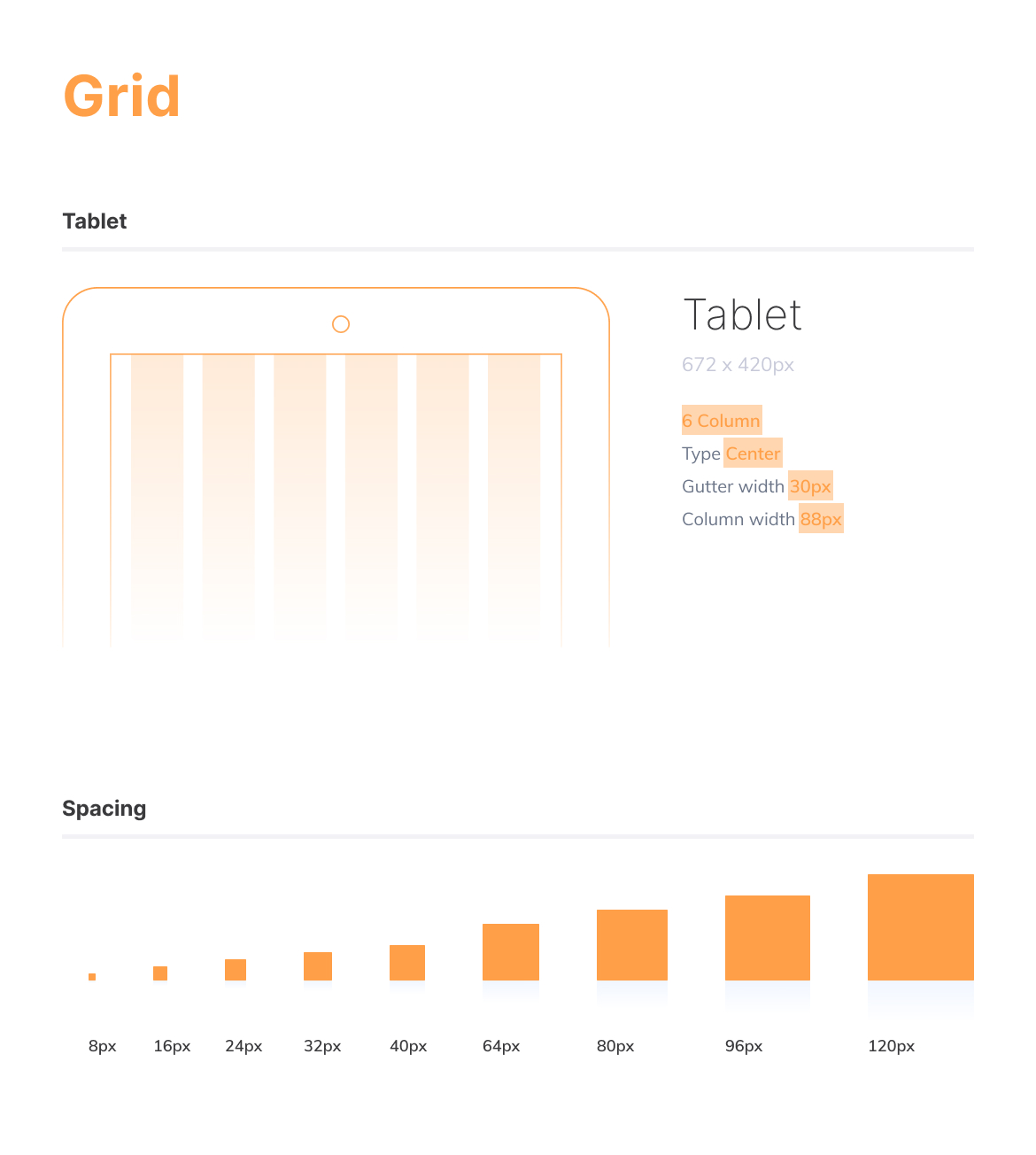
We created a style guide to help with maintaining consistency throughout the design.
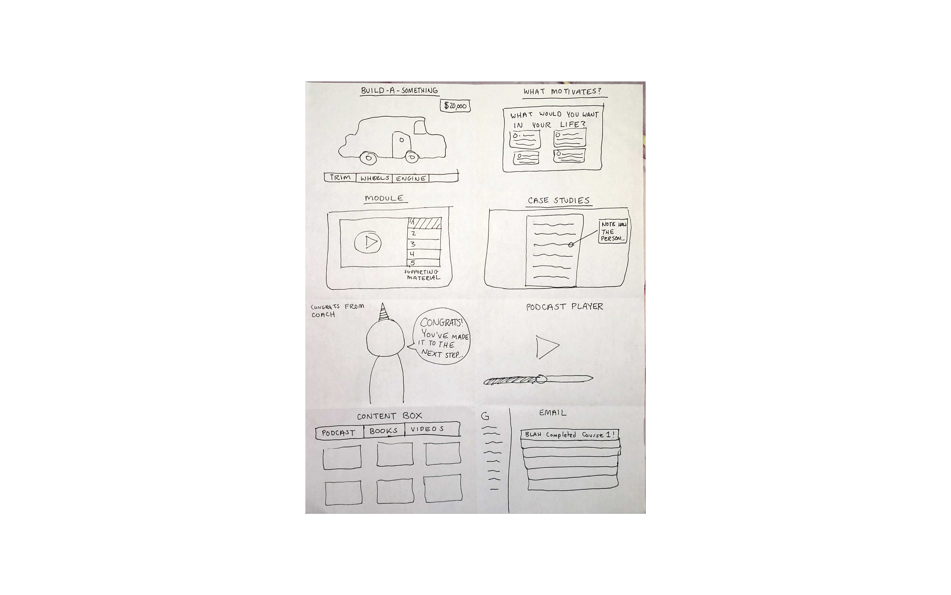
A narrative of how the app can equip you to go from being incarcerated to being a successful entrepreneur is important for incarcerated users.
The most important aspect for a student when choosing a class was divided between the connection to the teacher and the content of the course.
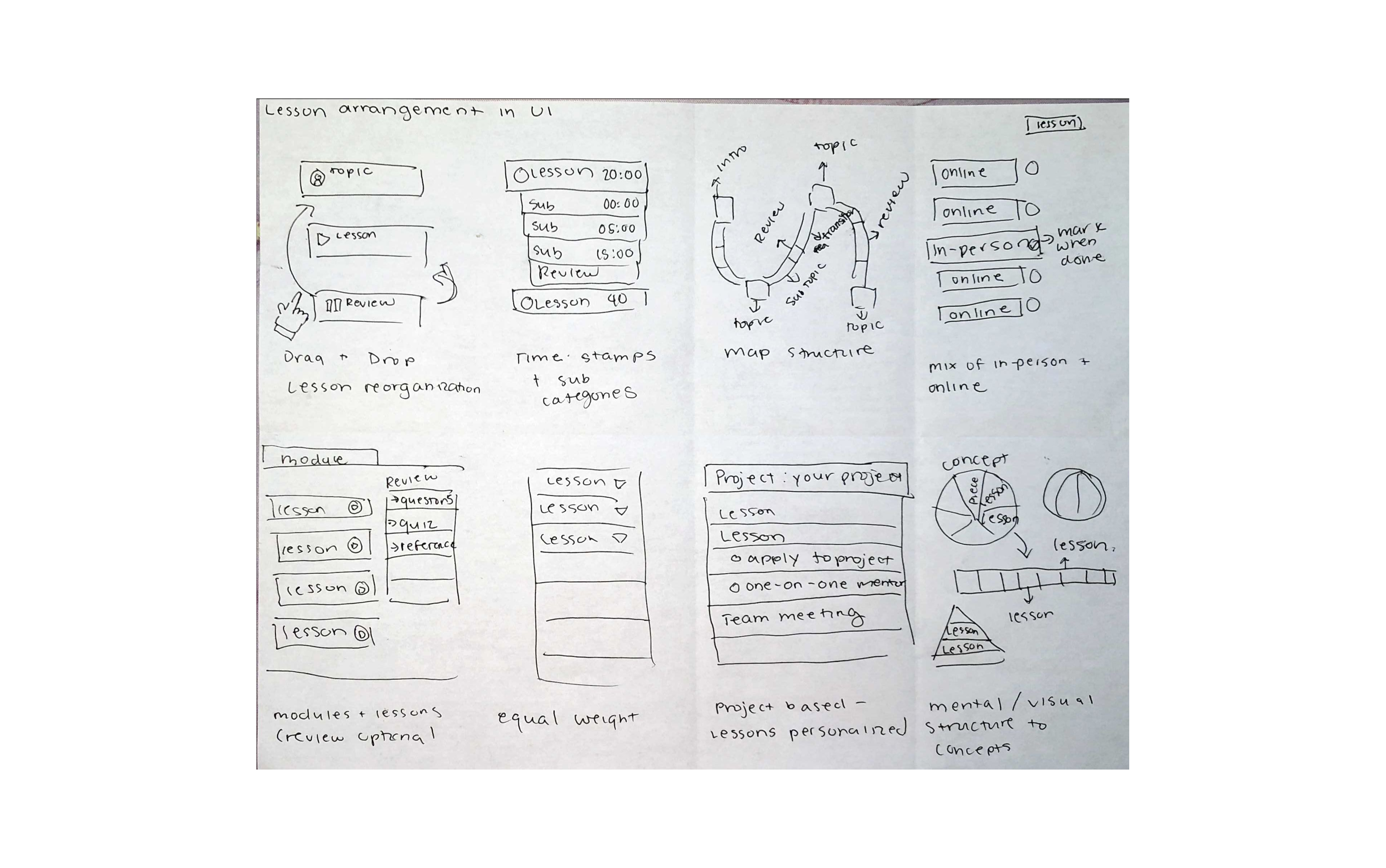
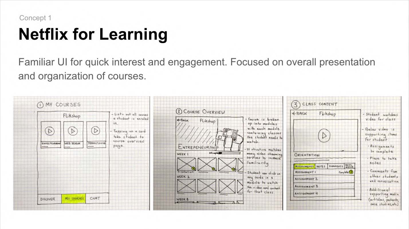
Design the UI to cater to those with varying digital experiences through the use of clear navigation and page design
Make information easily consumable by decreasing the amount of text present & using clear/concise wording.
Interviewing users currently incarcerated is practically impossible. The experiences of users previously incarcerated still proved insightful.
Understanding the expectations of our client and team members allowed us to complete tasks efficiently.
The sprint process isn't a straight line. Its okay to circle back to or speed up a phase during the sprint.
Moving foward despite a knowledge gap and learning from our mistakes was the best option to test our ideas.
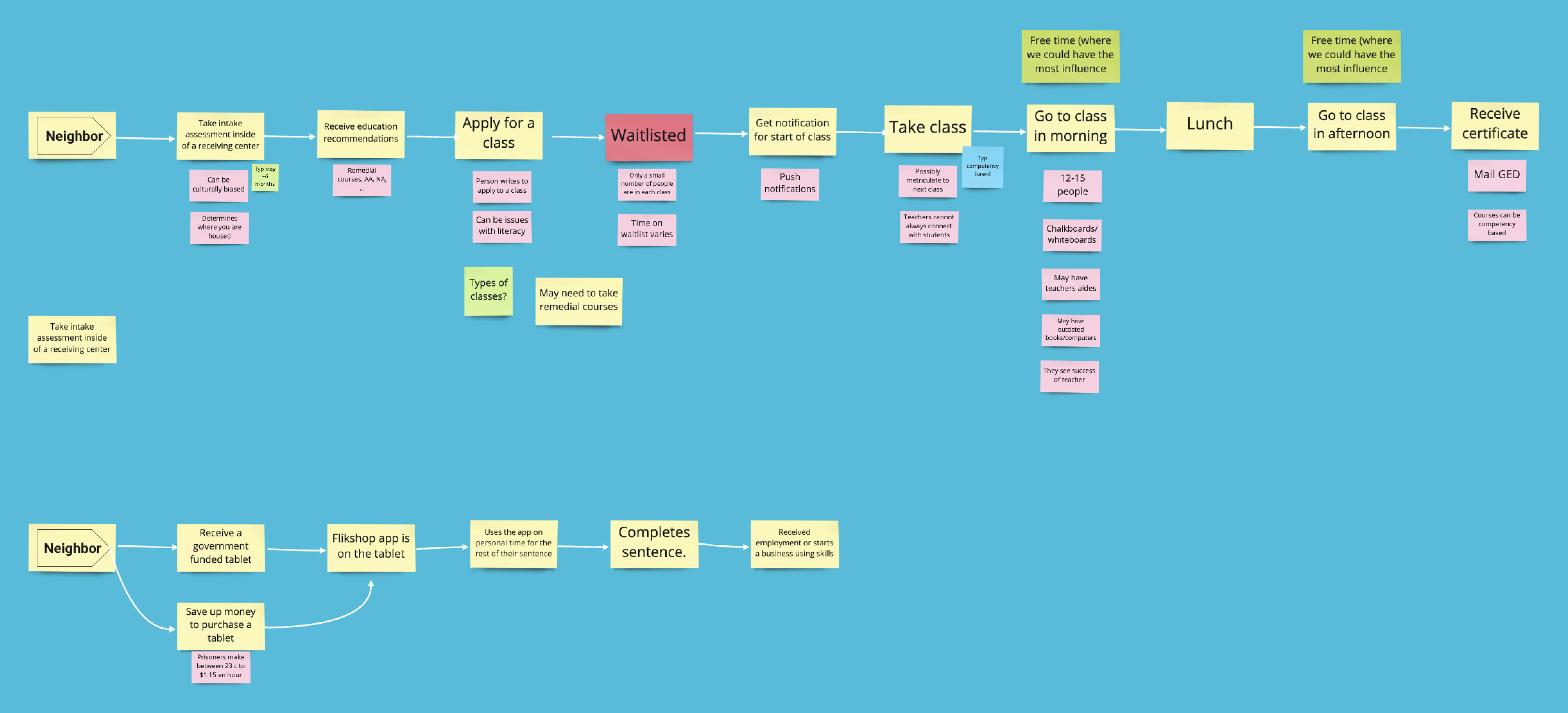
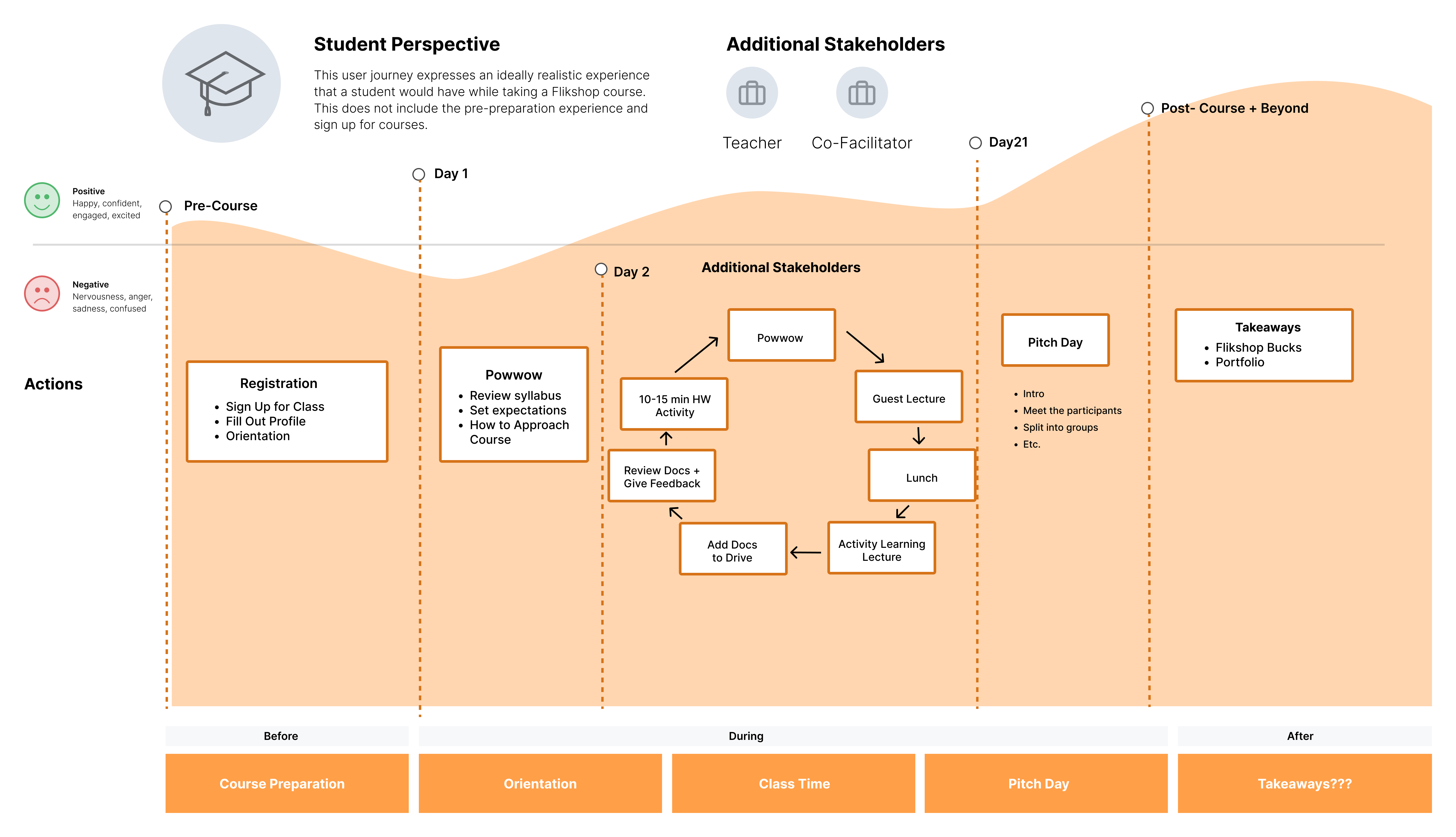
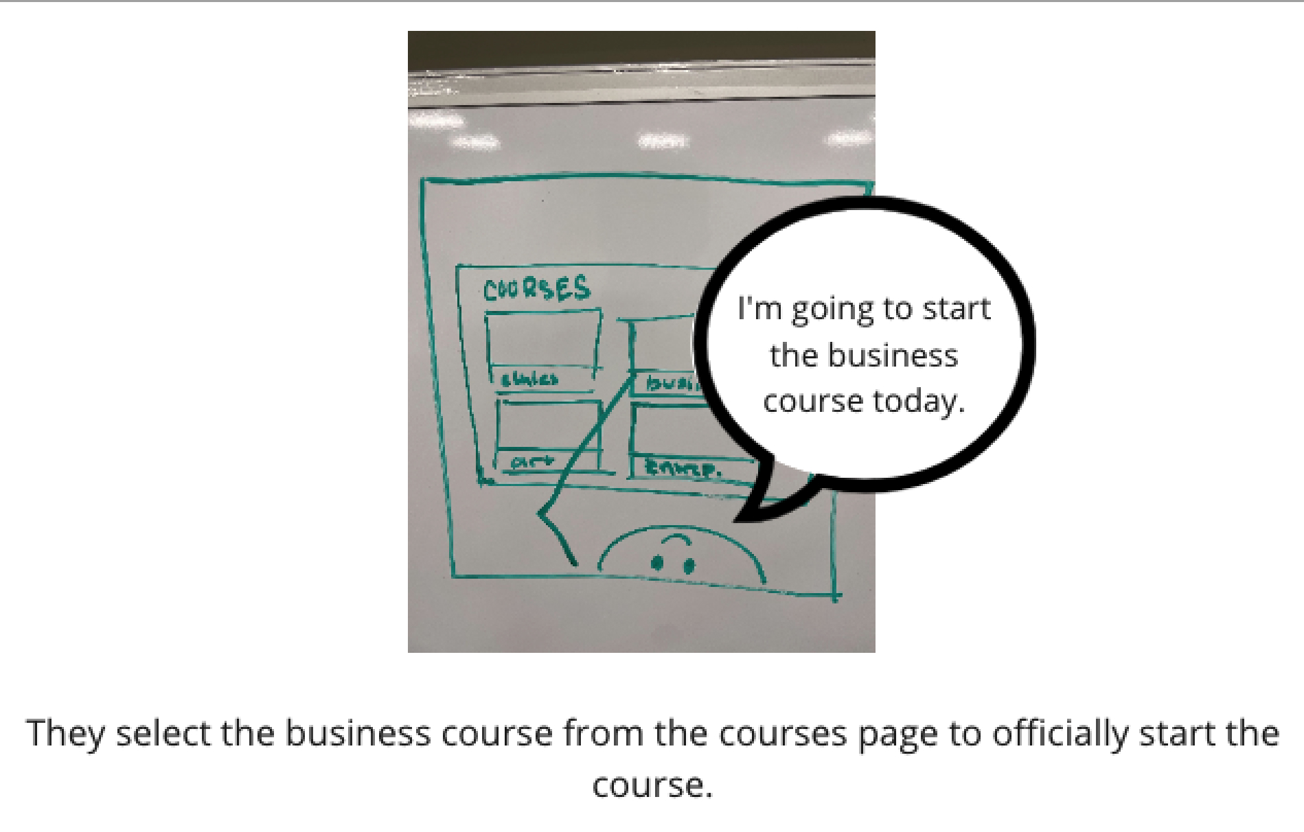
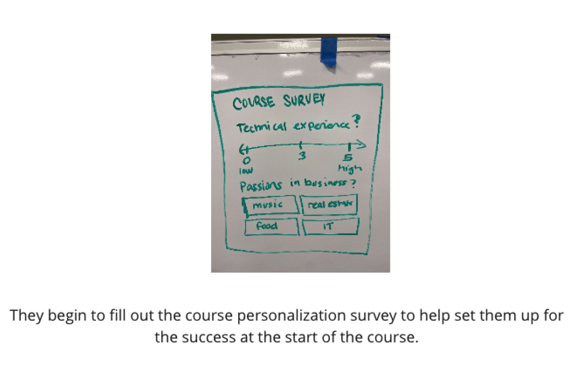
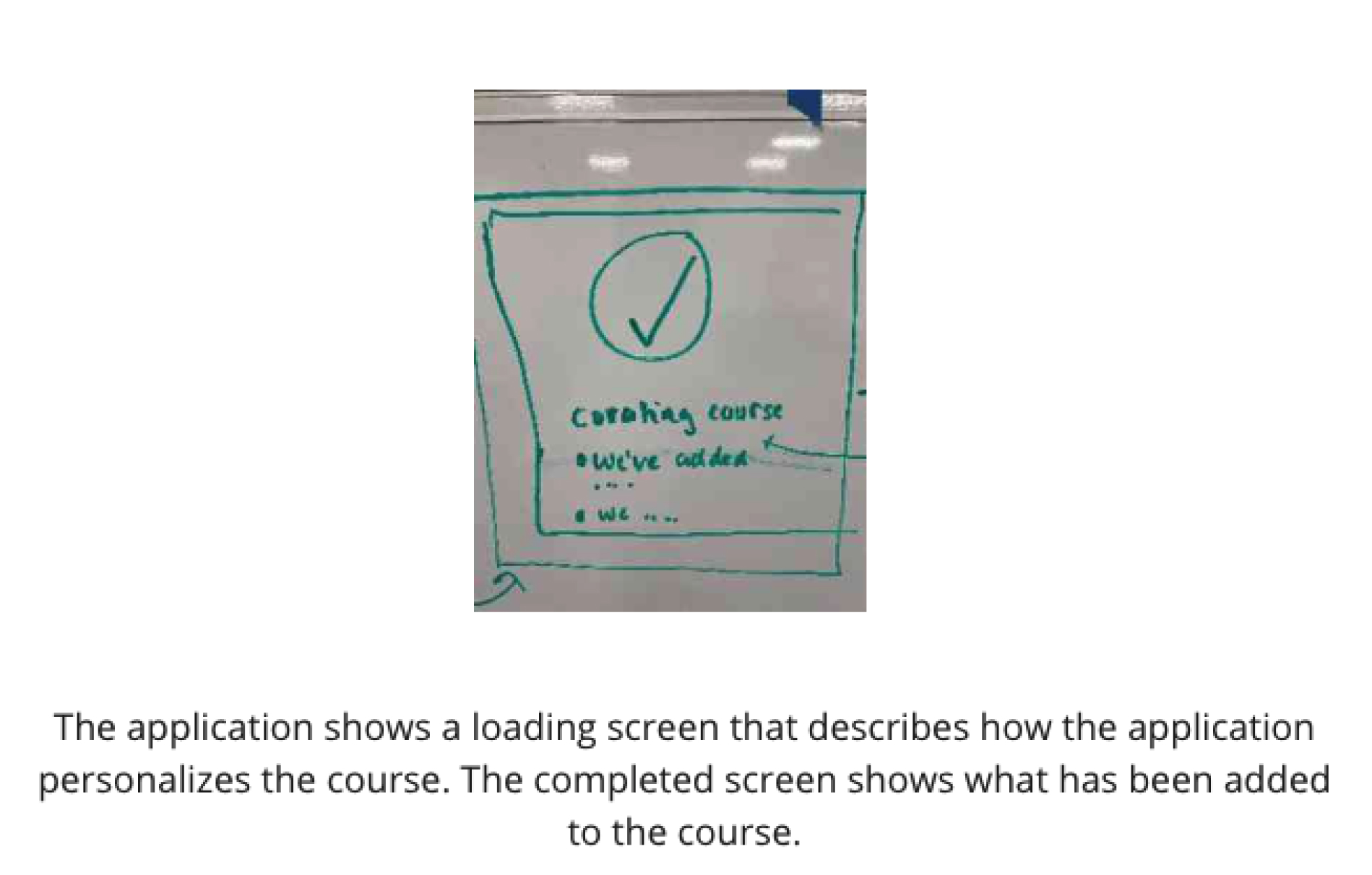
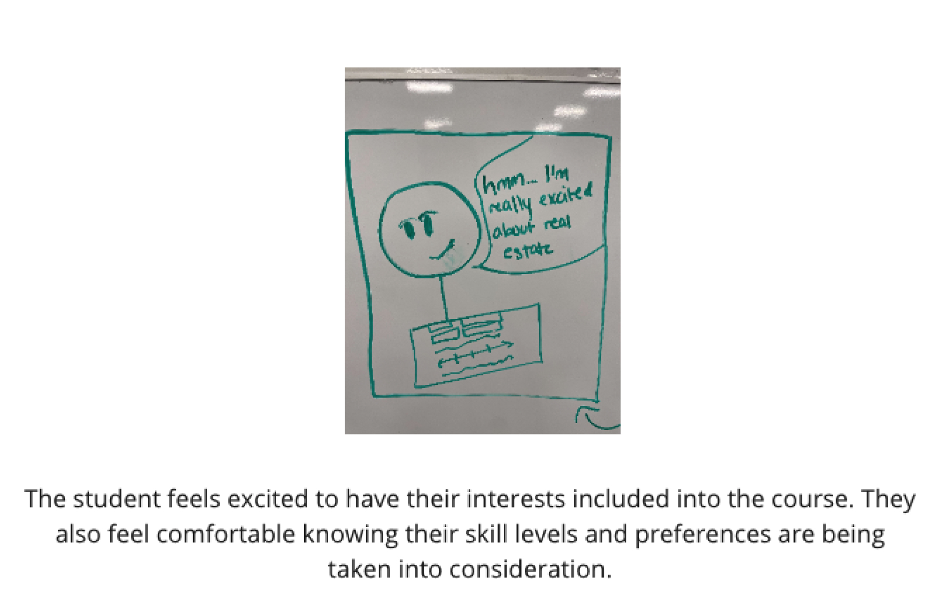
Journey map designed by Kayla Winbush
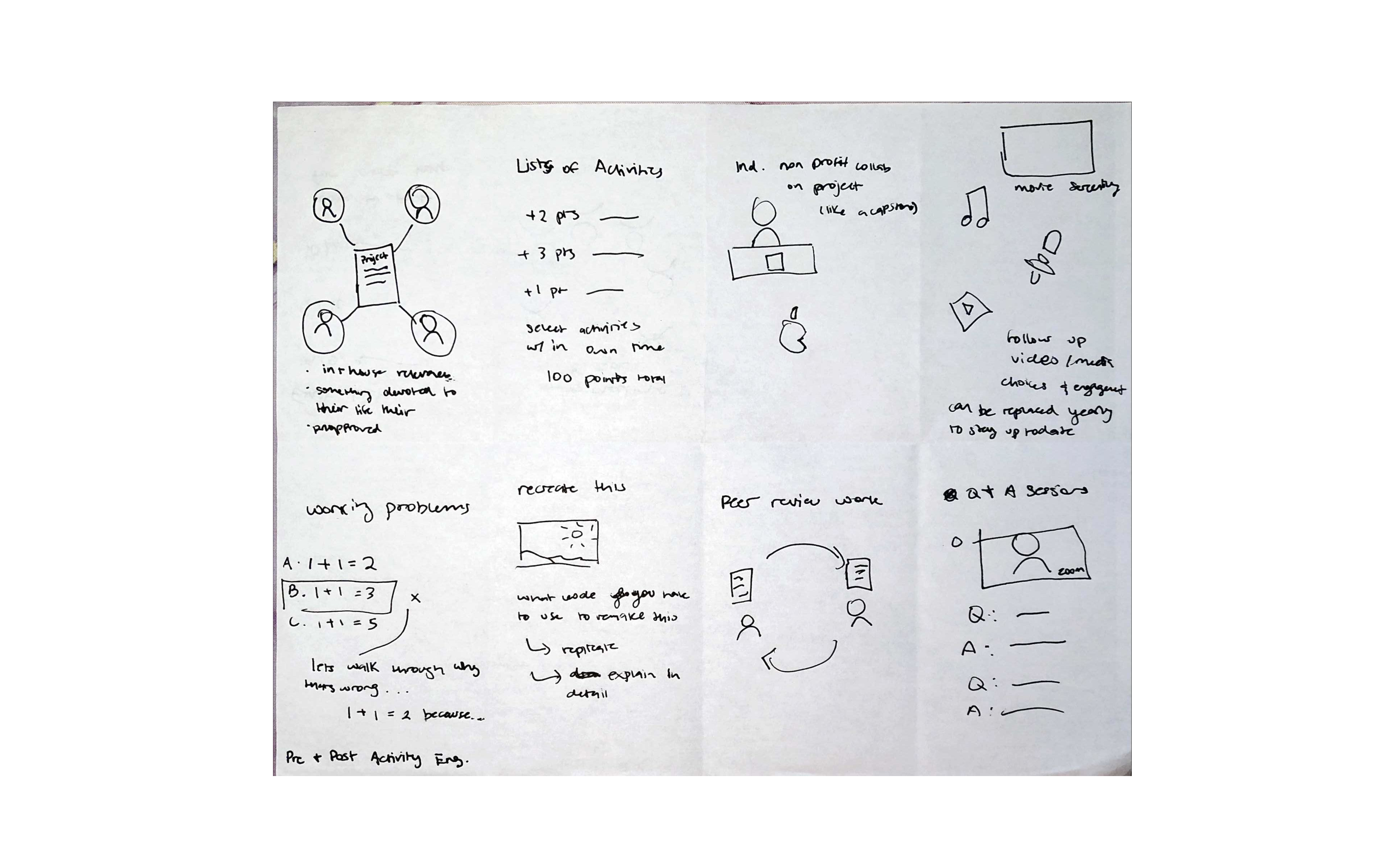
Each person spent 3 minutes sketching ideas from products or services we could use in the sketching phase of the design sprint.
The team developed a script that aligns the storyboard to the user and clarifies the structure of what mocks or experiences will be needed during testing.
We created a style guide to help with maintaining consistency throughout the design.
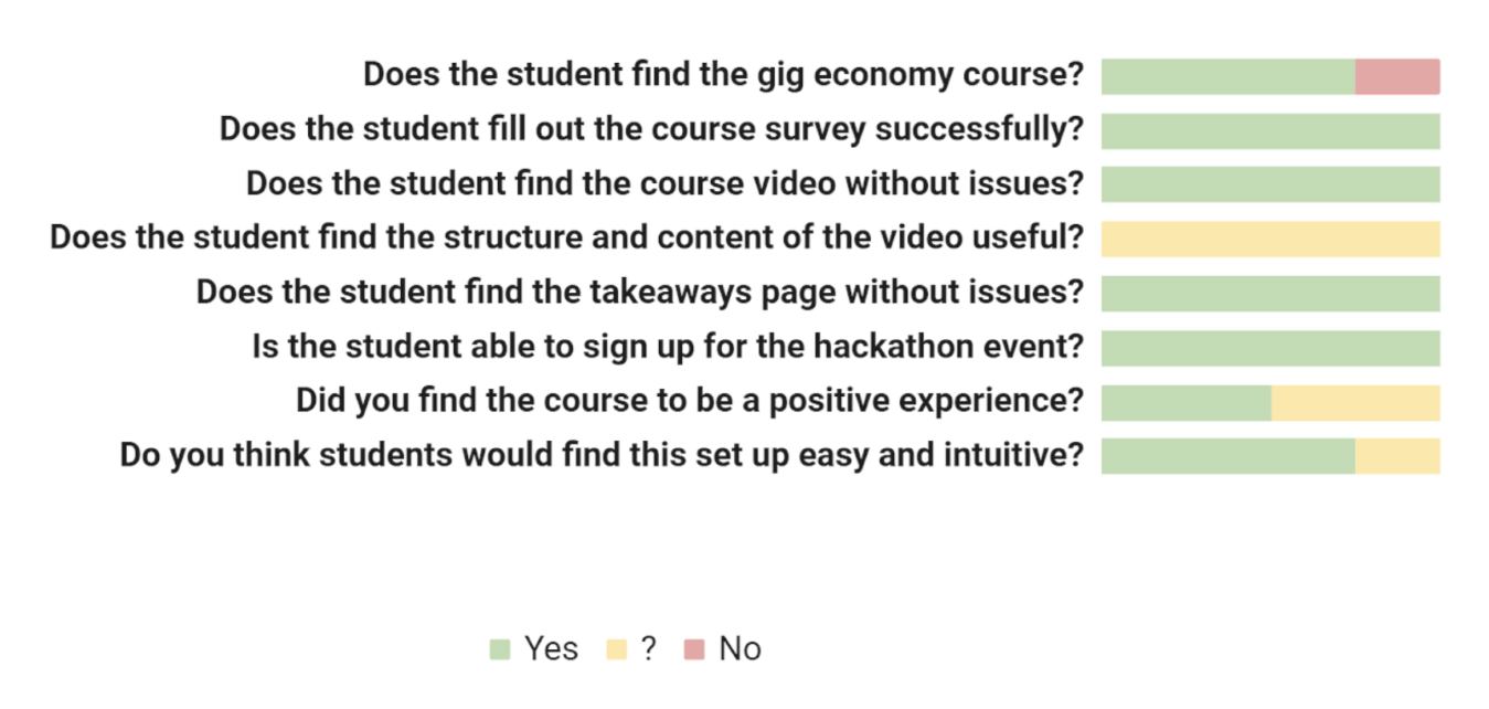
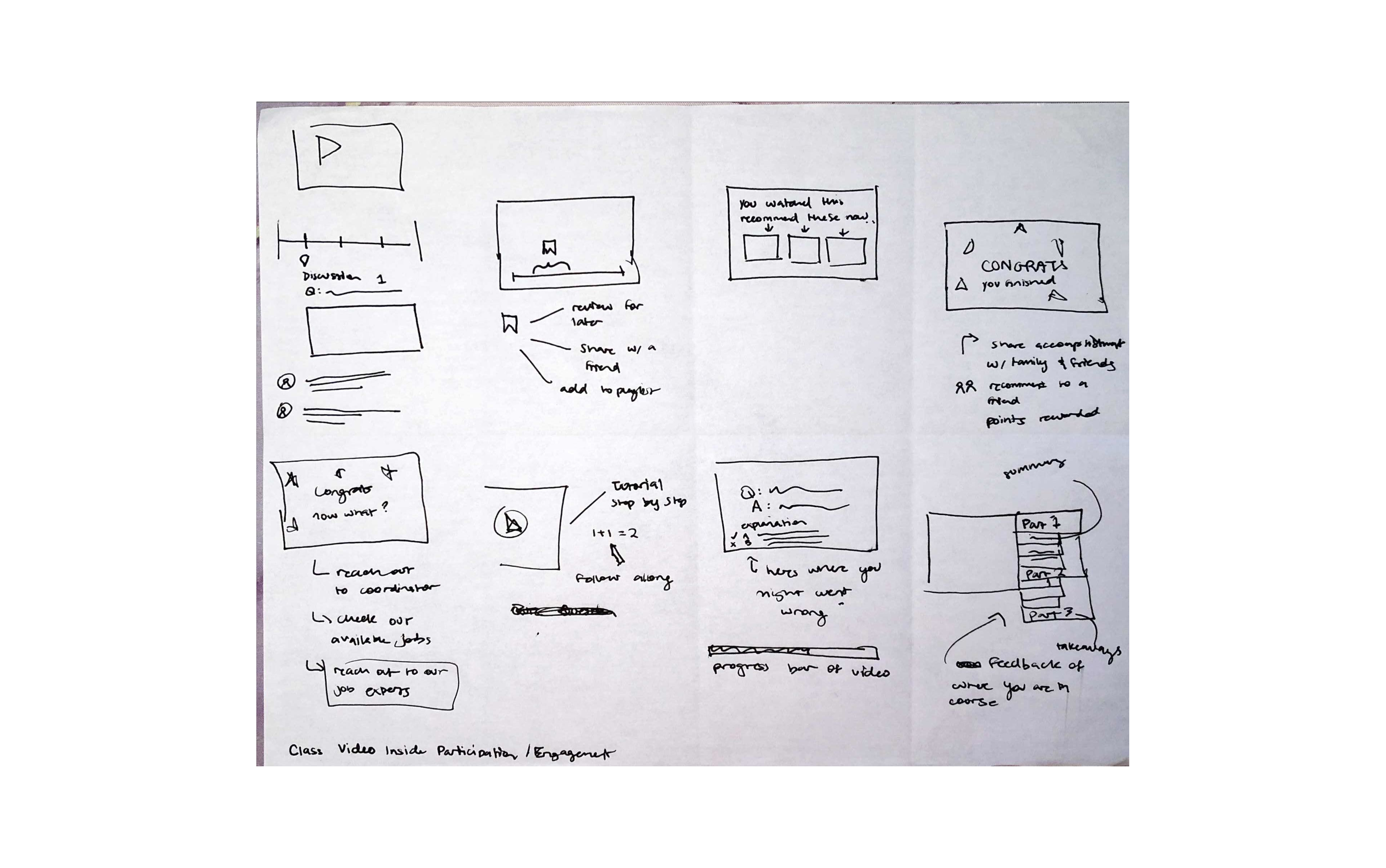
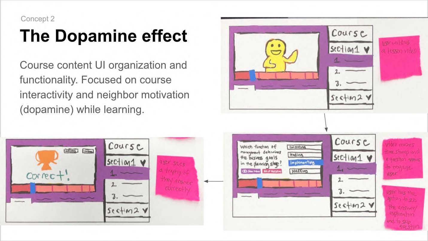
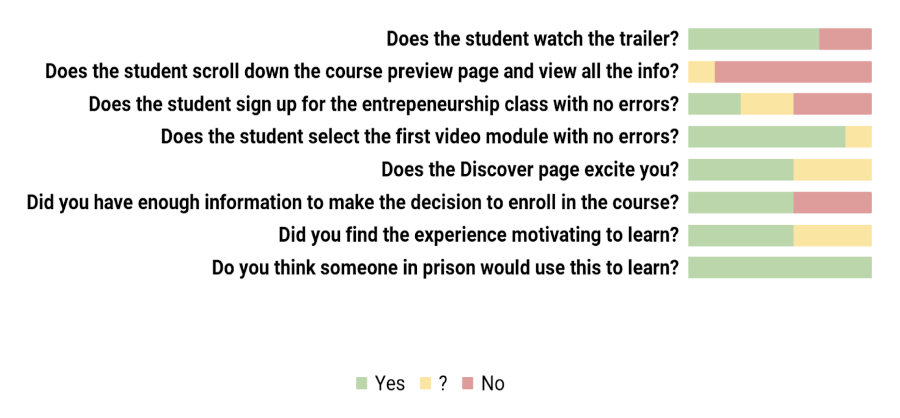
Rewards were seen as motivational and encouraging
Users need more information on how the Rewards could be used
Users need more clarity with the design of the ‘What You’ve Learned’ section on what you have learned already and what you will learn in future videos
Layout and structure of the app was easy to grasp and familiar (this may not be true for users who have not taken an online course)
Update buttons on surveys to make it clear when someone can select multiple answers or only one answer
Reorganize content of the Takeaways page (What You’ve Learned, Progress, and Rewards) so that it is more intuitive for users to find without direction
01
How easy is the app to use for people who do not have experience taking online classes?
02
Do students who are incarcerated find the course engaging and interesting?
03
Does the course have the most important components of a Flikshop business course?
We relied heavily on our client and the university to provide us with user participants and failed to find user participants on our own.
Going with a mid-fidelity prototype allowed us to collect the insights we needed surrounding functionality.
The team will be finalizing product stucture, interaction patterns, user scenarios, and technical environment/constraints document for each sprint in addition to the unique sprint goals.
Matt Alexander, Ghayas Akbar
Bree Douthitt, Markus Hines
Alea Oakman, Kayla Winbush
Product Design
User Research
User Testing
Adobe XD, Miro, Figma