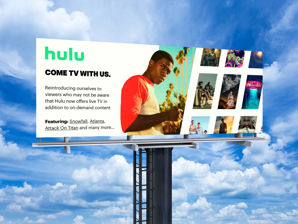
Visual Rebrand
of Hulu
An individual visual design project exploring the implementation of a new visual brand with Hulu through strategy and experimentation with form, color, and layout.
Visual Design
UI/UX
Indvidual
Figma
Photoshop
1 month
Creating new experiences, amplifying bold voices, and pushing the boundaries of storytelling is not reflected in Hulu's visual branding.
Problem 01
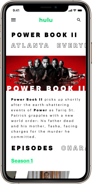
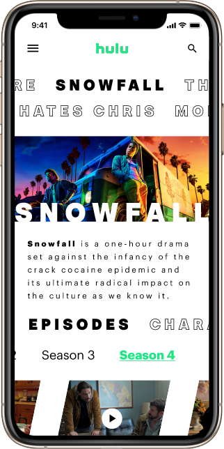
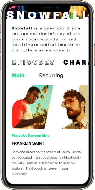
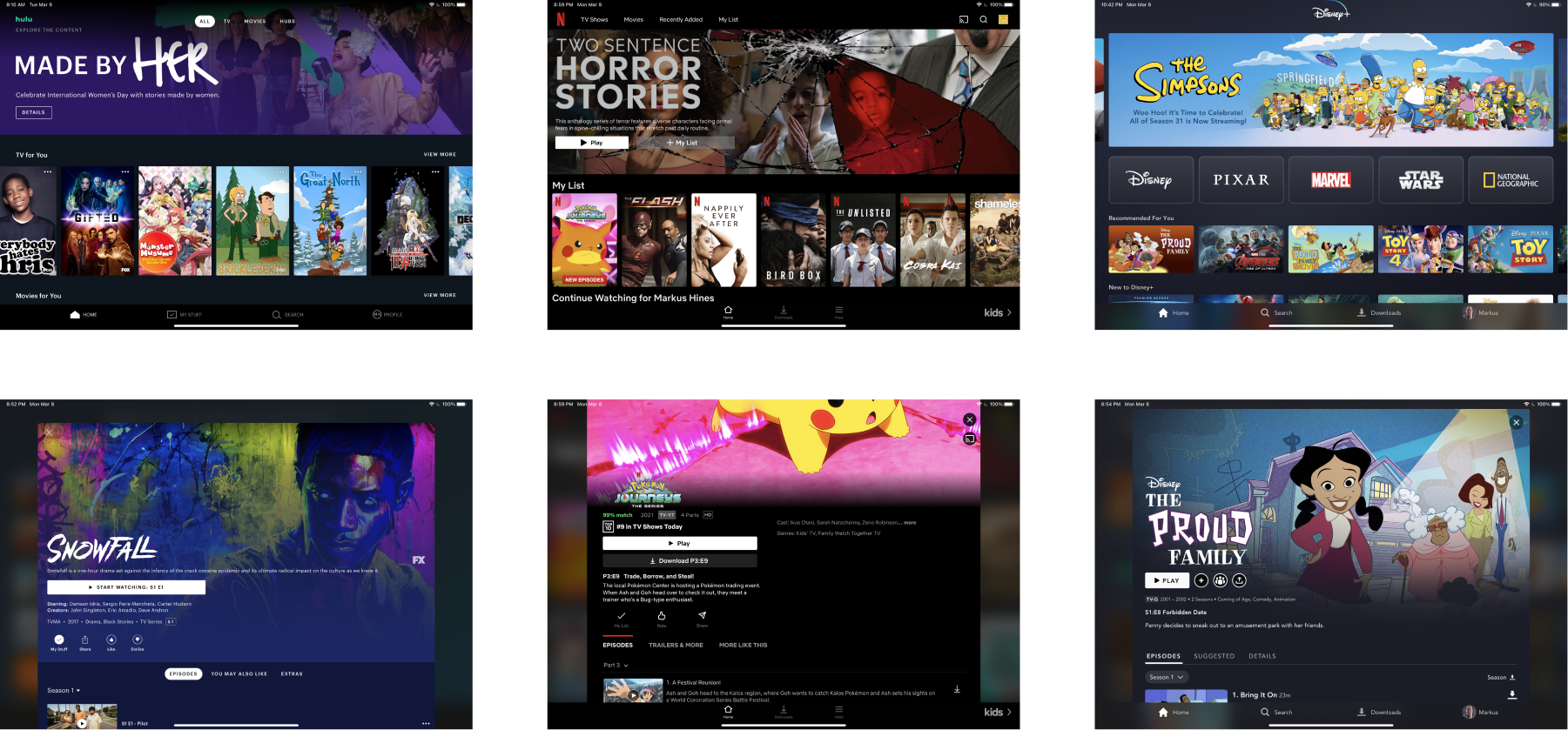
Layout and interface elements are too similar to other streaming platforms such as Disney+ and Netflix which doesn’t push the boundaries of storytelling and technology.
Problem 02
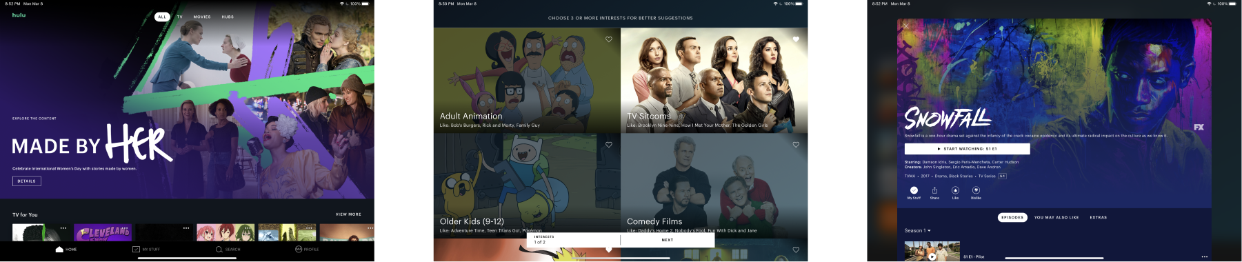
The design is extremely lacking in the use of typography and colors from the brand due to the possibility of issues with readability.
Problem 03
Lack of adequate spacing which can cause some shows & movies to be overlooked and makes comprehension more difficult
Diverge from the use of card shaped elements to represent shows/movies
Prominent use of the color palette and font styles in a way that does not detract from readability
Increase white space to improve readability and comprehension as well as draw attention to elements surrounding shows & movies
My peers were unsure of how the interface would be navigated
Some elements looked visually complex which in turn impacted navigation for my peers
My peers were happy with the layout, typography, and colors for the episodes.
Visual experience of Hulu for mobile
Billboard highlighting a new visual brand to attract customers.
Ticket memento/discount coupon rocking the new visual brand
Taking heed to the feedback recieved, I omitted a few cool ideas from my iterations according to my professor that need some refinement.
My goals didn't address how exactly it the business would benefit from a visual rebrand.
My type selection could have benefited from more constrast to make text more distinguishable.